
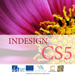
Characteristic Design Features of Covers for Modern Periodicals
 Content
of the lesson:
Content
of the lesson:
- Covers for Periodicals and Their Characteristics
- Examples of Covers and Their Properties
- Summary
Covers for Periodicals and Their Characteristics
Magazines represent a typical platform for innovation and creativity in design layout. They significantly affected the trends of design in the past.
Take a look at an example of a current magazine and its typical elements.
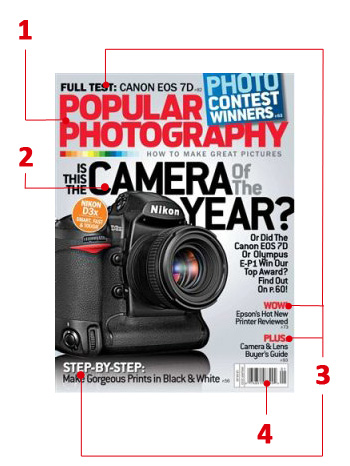
Typical elements of cover are:
- Header - it attracts attention. Usually written by a larger, specific font, in contrast with the background.
- Main eye-catcher - an important and significant element which usually presents the main topic (article) of the magazine. Sometimes written by a larger font than the header. It usually correspondences with the image in the title page. In our case it is built on the idea from the main eye-catcher.
- Secondary eye-catchers - using uniform or different designs (usually written by one font but different colors are used) which highlight other topics of the magazine. They should optically balance the cover.
- Bar code - usually horizontally or vertically placed on the main page. It might balance the draft optically.
In the following images you can see additional typical elements of cover design for periodicals, for example:
- Cite or scream - a part of text (usually a short cite from an article) which is placed inside an article (also at more places) and attracts the reader to the article and affects space optically.
- Boxes - part of an article or also a photo with its own longer description and with a title.
- Entry points - image element (for example initial, quotation mark, shape, graphics) which attracts the reader to a concrete place on the cover or to an article.
- Kuler - part of the magazine with service information which is usually printed on a worse paper (this term is being used for color smooth printing paper which is usually used for business and organization materials, for tickets etc.).
Examples of Covers and Their Properties
You can find several examples of covers for magazines in the following part; we will try to characterize them in terms of the appearance, typical properties and we will talk about the procedure how to create a similar cover.
Covers 1-3
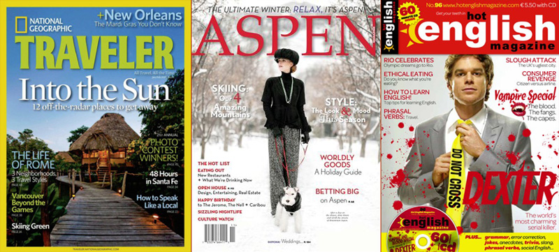
Cover 1 - Traveler
- Appearance - there is an exotic photo on the cover. Colors of texts are chosen from the photo. There are at least 3 fonts (Traveler - accidental font for the title of magazine, Into the Sun - serif font for the title of main article, another font is used for descriptions of sections with different color combinations to increase the contrast against the background). The cover also contains the logo of National Geographic.
- Graphics - all texts of different colors contain the effect of shadow in the same direction and with the same intensity. The photo has a yellow border around it. Texts are aligned to the center and to the borders with the same distance from the borders.
Cover 2 - Aspen
- Appearance - there is a professional winter photo on the cover. Colors of text descriptions are white (because of the background the readability is worse - several characters are highlighted to attract the reader), black (descriptions of topics) and red (logo of the magazine and the main topics). There are 2 fonts at least (ASPEN - accidental font for the name of magazine, font for the headlines of chapters - sans-serif font of the main articles).
- Graphics - red and white colors create nice contrast. The combination of red and black font was used on the white background. The photo also consists of these colors and very tastefully completes the whole color balance and simplicity of the cover. You can also see a shadow for the white text and the logo to highlight it. The head of the model partly covers the title of the magazine so the cover gets a spatial depth (as you will see this technique is used quite often) - we can use layers with masks for this effect.
Cover 3 - Hot English
- Appearance - This cover consists of a portrait photo of men wearing a suit and a shirt in front of shaded background. The photo is subordinate for all texts but the head controls the layout of all texts around it. The header of the cover is closed and optically separated in a red rectangle where the title of this magazine was typeset using a sans-serif lower-case characters. The fact that the title is typeset twice in the header which is not ordinate - as if the graphic designer wanted to convert it to an entry point because of the red rectangle. The title should be well readable in a shop in case that someone puts another magazine over this one. The main eye-catcher is the tie of the man which is very significant as well as all other parts which are red as the header. The bottom part of the cover is separated by the same color as the tie, the entry point is the CD. Although authors tried to increase the contrast, these aspects are not used well. The yellow strip unnecessarily dirturbes the tie, a good entry point for the main eye-catcher. Color balance is functional but the two colors (red, yellow) are too often changed in a small area so they make the cover quite confusing because they create too many significant elements. If the designer did not use the bottom strip, the cover would be better.
- Graphics - The first interesting element is a decoratively stylized sun in the title of the magazine which creates an entry point for the title, it has a decorative function here. You can see the drops of blood which randomly fill and overlay most of the cover. The blood illustrates the main eye-catcher of this number and also the plot of the mentioned series (you can create is easily in Photoshop using a set of brushes called "bloody", "splatter" or "ink"). The characteristic font was kept for the main eye-catcher (series) which is an advantage for the author but a disadvantage for an American reader who has probably already seen the title and will not think about it so long. If the author used another font, he would be able to attract the reader a little bit longer. However, the fact that he used the same color below the title, thwarted his effort.
Covers 4-6
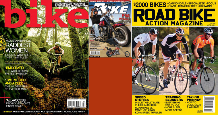
Cover 4 - Bike
- Appearance - There is a thrilling photo of a downhill biker inside a forest. This photo creates the whole background so all colors are rather natural. The title was typeset through the whole width using lower-case accidental serif font of red color which is contrasting to the natural colors of forest. The titles of articles are also written by significant colors which cannot be found in a forest. The main eye-catcher is only a bit larger than the other eye-catchers. A kuler is inserted as the bar code which clearly disturbs the whole appearance and attracts too much attention. The authors should have placed it at least below the texts. Except from the cite under the main eye-catcher and the title of the magazine only 2 cuts of sans-serif font were used. The whole cover is divided to virtual boxes - Header, Eye-catchers, kuler with bar code and the box at the bottom border which is used for a regular section Tested.
- Graphics - Except from the title of the magazine which drops a light shadow there are not special effects. The black rectangle with opacity around 25 % increases the contrast in the left part. There is also an attempt to attract attention at the main title using a vector flower motive which does not fit well into the whole static design of the cover. A small separating element can be found at the last text which is a decorative entry point for additional titles below it and it fits the cover unlike the flower motive.
Cover 5 - Hot Bike
- Appearance - The cover is a photo of one biker and his chopper so the content of the magazine is clear, the intention to attract attention of all bikers is probably satisfied. The cover is supplemented by a small photo of the same chopper from another side. The header contains the title of the magazine using a wider sans-serif font in capitals. The main eye-catcher is pushed to the header and is separated by another font and color. The other texts are on the opposite side of the cover and the whole text respects the motive of the cover - the biker. Because this photo is quite colorful and contains many shapes and colors, the tightness of text and graphical elements is not good and the cover looks quite chaotically. Also the bar code is not well placed. The cover contains at least 3 different fonts.
- Graphics - You can see that maximal contrast was used in the title of the page and the black color is even stroked. The whole text drops a strong broken shadow. Adjusting the photo in Photoshop would probably make the photo clearer - unnecessary disturbing elements could be eliminated in the background of the photo.
Cover 6 - Road Bike
- Appearance - This cover is divided to three parts. Header which contains the title of the magazine where a capital sans-serif font was used, a smaller sub-headline and information about the content of the magazine, everything written using the same font. The next part, the middle of the cover, is vertically divided by three reportage photos with the same content. The bottom part contains three main and several additional eye-catchers. Only one font with two cuts was used for the whole cover and because of the background and the color of the text, its readability is based on the size of the font. The bar code is quite disturbing here. An interesting idea is the repeated three (the whole cover is divided to three parts, header to three lines, three photos, the bottom part is divided to three columns).
- Graphics - There is no effect used for the texts and the whole cover is based only on the color and type of font. The photos could be edited anyhow because they look like photos from a family album.
Covers 7-9
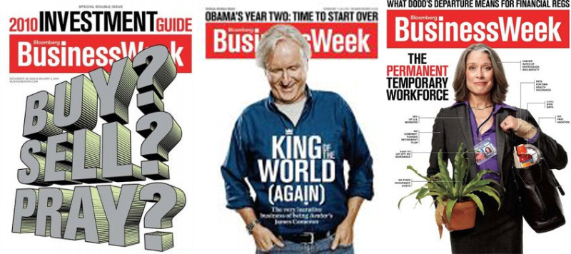
Cover 7 - BusinessWeek
- Appearance - the three headlines are absolutely dominant on the title page, they are probably the main topic of this number.
- Graphics - 3D headlines were created in Adobe Illustrator, you can see different sizes and colors of words in the headline which separate the information.
Cover 8-9 - BusinessWeek
- Appearance - there is a photo of older people on the title page. You can see that the authors of the magazine let the photo overlay the title of the magazine - this can be used in case that the magazine is well-known.
- Graphics - you can see elegantly solved lines which contain descriptions. Also the word Bloomberg (probably the name of the publishers) is nicely fit into the headline. The dot above i was replaced with a crown in the text King World on the cover 8 - the crown corresponds with the meaning of the title.
Covers 10-12
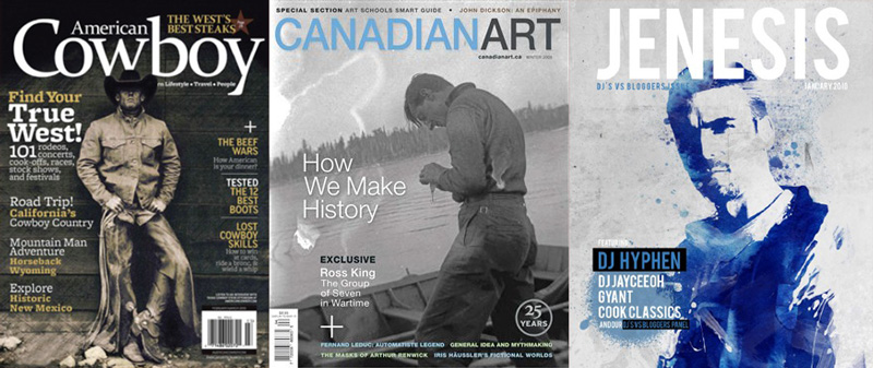
Cover 10 - Cowboy
- Appearance - there is a cowboy on the cover, the photo was converted to black-and-white to illustrate past times. You can see plenty of texts written by different sizes and colors at the borders which tell what is inside the magazine.
- Graphics - the word American is elegantly put into the headline. Texts are aligned to borders to create columns.
Cover 11 - CanadianArt
- Appearance - there is also a black-and-white photo on the cover which should illustrate peace and memories. There are not so many texts, the photo is the key.
- Graphics - there are two nicely separated words in the headline because of using different colors - this technique is quite common. You can also see the unusual stamp 25 years in the right bottom part.
Cover 12 - Jenesis
- Appearance - this is a classical art magazine which is designed for a particular group of people - this one deals with music. Photos and headline are the key because there are not many other texts in the remaining parts.
- Graphics - art photos can be nicely and quickly created using filters in Adobe Photoshop, then the photo was probably colorized.
Covers 13-15
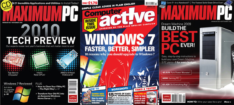
Cover 13 - MaximumPC
- Appearance - this is a classical magazine focused on computers, you can see several pieces of hardware and computer effects
- Graphics - the headline was again divided using different colors, the text 2010 uses a light gradient and the components are highlighted by an interesting background.
Cover 14 - Computer Active
- Appearance - the reader can immediately see the main topic of this month - the large 7 should associate Windows 7 for all computer fans. Also the fact that the name of magazine is inserted in the top part of the digit is quite unusual. Using other than standard straight shapes the magazine gained an unusual and attractive appearance.
- Graphics - take a look at the exclamation mark in the headline act!ive which symbolizes an inverted i. The text has enough contrast and is well readable (a sans-serif font was used).
Cover 15 - MaximumPC
- Appearance - there are not many new things, texts are visually separated using two colors.
- Graphics - thin lines with descriptions are elegant, also the background is suitable to this topic.
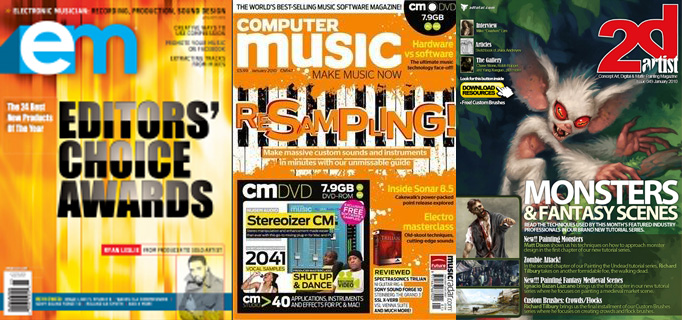
Covers 16-19
Covers 16-19
Try to guess what is interesting and conversely what should not be used for covers according the previous samples. Think about the type of text, colors and layout of elements.
Covers 20-22
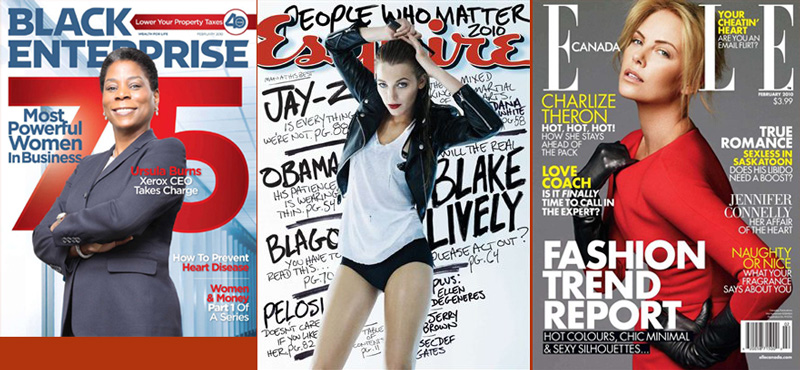
Cover 20 - Black Enterprise
- Appearance - you can see a photo of woman in a gray suit on the cover, headlines and background are together balanced (red, blue and white). There are at least 2 fonts (Header and the rest of the text).
- Graphics - at least one font uses a gradient. The background is colorized (blue). Single elements are played into layers to overlay partly.
Cover 21 - Esquire
- Appearance - there is a photo of girl on the cover, the header is behind her and also the background is created from several titles. Colors of the clothes and colors of the background are balanced.
- Graphics - layers are again used so the girl looks like she is standing in front of the rest of the cover. The header of this magazine uses a light shadow, the text in the background was probably written by hand, scanned and then adjusted.
Cover 22 - ELLE
- Appearance - there is a photo of woman in front of gray background on the cover. Used colors are yellow, white, partly black and significant red. Yellow and gray nicely fit to each other, black and white can be used anytime and the red color created a high contrast and highlights the woman in the photo.
- Graphics - there are at least 3 fonts in the photo, the largest one points eyes to the main article, yellow and white separate the other topics between each other. Single titles are aligned to the right or left. Single eye-catchers are placed "zig-zag" so a reader skips from the left to the right and continues to the bottom where the main topic is written. The element of black rectangle with white text is interesting. The head of the woman covers the whole one letter of the title of the magazine - that creates a spatial impression
Covers 23-25
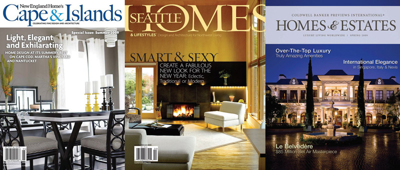
Cover 23 - Cape & Islands
- Appearance - there is a photo of house on the cover, the whole idea is simple, the main element is the photo. The header is significantly separated by a white strip.
- Graphics - there are at least 3 fonts in the cover. The words in the title of the magazine are separated by a character of another color which makes the headline more vivid. There are words light, elegant in the title and the design of the cover corresponds with it. Eye-catchers drop a light shadow to improve the readability.
Cover 24 - Seattle Homes
- Appearance - you can see a photo of interior on the cover and corresponding enjoyable and warm colors in combination with the elegant black font which continues from the photo - this is an interesting design element. There is also a significant part in the header where another word is written instead of a part of the H letter. The photo is the key and the text does not distract from it.
- Graphics - in case you have a quality photo, this cover should not be any problem, the only problem might be to insert the "seattle" into the header which can be done for example by a mask which should cover those parts of letters H and O. Then you can add the seattle word. It is known that sans-serif fonts should be used for headlines but here you can see that a serif font is not a mistake - it looks nice.
Cover 25 - Homes & Estates
- Appearance - you can see a night photo of a villa. The design of the cover is quite simple. White titles are inserted into places where they can be easily read. The title of the magazine is simple but splendid, there are two hues of gray for the text so it is not disturbing but well readable.
- Graphics - there is a light shadow under the white titles, the text is more significant, the contrast with background is bigger and the text is better readable. You can see a decorative character in the header, these characters can be found especially in the "Open Type" fonts.
Covers 26-29
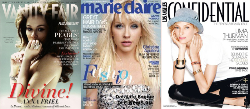
Cover 26 - Vanity Fair
- Appearance - you can see a photo of woman and several texts around it in the image. There are quite small except the word "Divine" which is probably connected to the woman on the photo. To highlight it a red color was used, the font and its cut were changed. The header of the magazine is interesting because the title gradually fades out to the photo.
- Graphics - you can see a combination of several fonts, at least 4, which is a maximum number that can appear on a single page. The header uses a gradient which gradually decreases its visibility - you can get this effect using mask. Texts are aligned to the right but the main text is aligned to the center and is also written in italics which unifies the different fonts. The background was created as a gradient from white to gray-blue.
Cover 27 - Marie Claire
- Appearance - you can see a girl on the cover, single texts are placed around her. The whole design is unified into one color, only hues are changed. The header is very significant and also the eye-catcher created from "flying" letters which create the word "Fashion". Then you can see a black rectangle with white text which is quite awry. You can also see the highlighted word hair inside the title "Great hair days". The word was written in bold or semibold.
- Graphics - this page looks quite crowded and fussy. There are interesting graphical ideas but there are too many of them. The photo does not have enough space around it. The title is also interesting because it covers the whole width of the page, however, this only increases the feeling that the whole page is crowded. The author might have thought that a crowded page will attract readers. The title "Fashion" was created easily - every letter was separated into a new layer and those layers were slightly moved.
Cover 28 - Confidential
- Appearance - you can see an actress on the cover and the texts are placed around her using the colors from her clothes. This cover is simple and elegantly done. The head again covers the title of the magazine.
- Graphics - there are 2 or 3 used fonts. All texts are aligned to the right but the photo of the actress is rather aligned to the left and the cover creates a balanced impression. Used cuts of font (light, ultralight) are recently very popular and nicely fit to the photo.
Covers 30-32
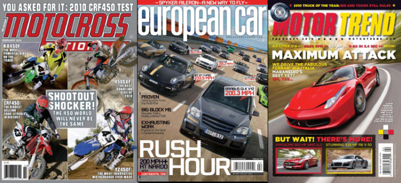
Cover 30 - Motocross
- Appearance - there are 4 very similar action photos of motorbikes on the cover which almost overlay the second word from the title of the magazine and partly also the main eye-catcher. The gray box with white border stands out from the rest. There are 2 fonts - one for the title of the magazine and another one for other texts. Both are sans-serif. The color scheme is simple; white text on gray background and significant red color for the title of the magazine.
- Graphics - The title periodic is highlighted also using black stroke and light white shadow, the italics style adds dynamic to it. All elements are parts of a fictive border. Only parts of motorbikes stand out from the image. Texts are aligned to both sides and even more attract attention to the center. The main eye-catcher is aligned to the center.
Cover 31 - European Car
- Appearance - The photo of tested cars dominates the whole cover. All elements overlay this photo but the spatial effect is kept because of the direction of the road and the front car which stands out. There are 2 fonts - one for the title of the magazine which is written by lower-case letters and another one for the texts. Both are sans-serif. The background color is not available, it goes from the color of the road. The most significant headlines are written using white color, the rest is black. You can see an interesting element when cars are labeled with cards which contain name and top speed. Then the subheading of the main eye-catcher is separated from the other texts using a transparent rectangle.
- Graphics - the main photo is rotated which evocates a banked curve - so high speed and dynamics. The title is stroked using a light black shadow to be separated from the background. The other texts are aligned to the left with a light suggestion of border. The bottom left box has adjusted opacity.
Cover 32 - Motor Trend
- Appearance - also one photo dominates the whole cover but this time there is only one car in it. The texts are written by red - white - yellow - background black colors and the black color was also used for the title of the magazine. All colors are combined by the graphical element +. The red tunes to the color of the car. There are traditionally two fonts - one for the headline and another one for the texts. Both are sans-serif. Single texts are separated by colors. The main eye-catcher is highlighted by white color. The bottom rectangle with photos is transparent black, single elements are highlighted by colors. The graphical element in the top left corner informs us about the 60th anniversary of the magazine. All elements are again in a fictive rectangle.
- Graphics - all texts drop a black shadow to be separated from the background. The background of the photo is blurred to highlight the car and to add dynamics and evocate speed. This is completed by the slight italics in the header title. The opacity value of the bottom box was adjusted.
Covers 33-35
Covers 33-35
Try to guess what is interesting and conversely what should not be used for covers according the previous samples. Think about the type of text, colors and layout of elements.
Covers 36-38
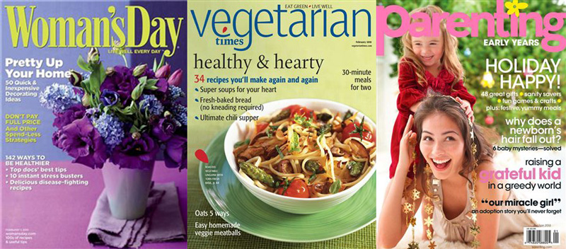
Covers 36-38
- Appearance - these magazines are typically designed for a particular group of people - women, vegetarians, parents. There is usually a photo on the dover with titles of sections which can be found in the magazines.
- Graphics - the insertion of the word times was nicely solved in the cover 37, the texts overlay the background photo. You can see that there is a flower instead of a dot above the i letter in the third example, but the headline is not ideally readable (another color would be ideal). The photo is optimistic and induces the readers to open the magazine.
Covers 39-41
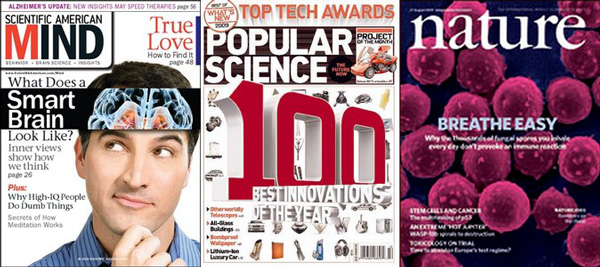
Cover 39 - Scientific American Mind
- Appearance - the main eye-catcher in the black box with the image of brain dominates the whole cover. Another significant element is the title of the magazine. The main color is white with black texts. For a significant text is used red color and the biggest contrast is used for the main title - white on black. The person in the photo looks at it which even more attracts attention to it. There are more fonts: title and the main eye-catcher sans-serif, other texts serif. Italics are used for the number of page. The cover is not uniform because of the fonts but also because of many colors (several hues of red, violet above, dark violet for the graphical element near the right border and other colors. The cover also uses a fictive border which slightly exceeds and destroys the uniformity of the page although it is separated from the rest by the significant box.
- Graphics - white on black creates the biggest contrast so this is ideal to attract attention. The fact that the person is looking into the head is also well designed. Texts are aligned according to the side - to the left or to the right side. There is a strip in the bottom part which contains a text and is separated from the rest by a vertical line.
Cover 40 - Popular Science
- Appearance - the first thing which is seen by anybody is the 3D number 100 which is followed by the title below it. The cover is white so the red color is very significant. The title also dominates on the background brown color. The other texts combine orange and black colors. Preview of inventions from the articles create an interesting graphical element - they represent the really big number. The magazine also contains a box from which protrudes a part of photo and also the "stick" which informs readers about news. The top text got a spatial highlight.
- Graphics - the cover has uniform colors - black and orange from the photo. This uniformity is disturbed by the main text with the red color. Used 3D letters correspond with the title "Popular science" but the number would be sufficient. The cover is now quite fussy.
Cover 41 - Nature
- Appearance - the strength is in the simplicity. Used photo from microscope was well chosen. Colors are given by the photo, texts are especially white except the main text with the light hue of blue color which tunes with the background. There are two fonts: title of the magazine - serif and other texts - sans-serif.
- Graphics - take a look at the nice serif font and used ingot. The cover uses a fictive box and texts are aligned according to sides except the main title which is aligned to the center.
Covers 42-44
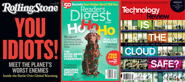
Cover 42 - Rolling Stone
- Appearance - a simple cover with a significant shout as the main topic. The background color is black, red is used for the most significant text and a light gray for the subheading. The yellow text is separated by the color. There are 3 fonts: title of the magazine, main title, secondary texts.
- Graphics - the simplicity of the cover is destroyed by different fonts and colors. It would be enough to separate the secondary text only by color.
Covers 43-44
Try to guess what is interesting and conversely what should not be used for covers according the previous samples. Think about the type of text, colors and layout of elements.
Covers 45-47
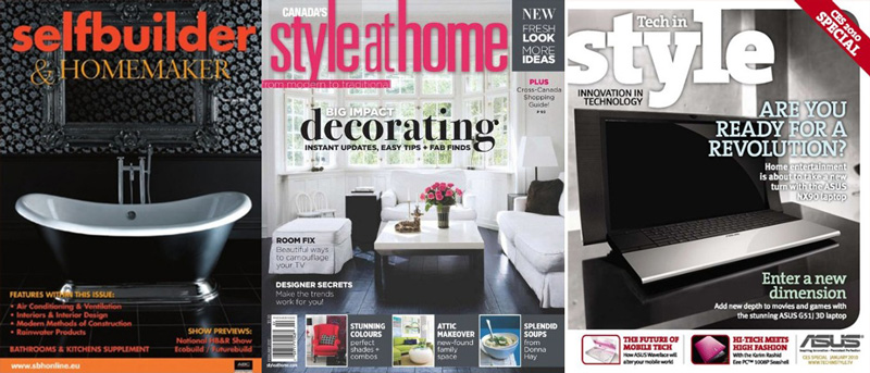
Covers 45-47
- Appearance - these are classical magazines which deal with the interiors - you can see it immediately. The appearance is modern, clean and friendly - representative parts of flats and houses are being chosen.
- Graphics - you can see the contrast of headline, other texts are aligned to the bottom, center or to a side. There are usually more images in the bottom part, bar codes or other information. Take a look at the inserted preposition inside the headline of the middle cover - it was separated by a different width of characters.
Summary
We can summarize several points which are often used and which can provide more or less quality title page of every magazine:
- using colors to separate words in headlines
- overlaying the headline with photos or a part of photos in case that the name is well-known
- using other shapes (stars, polygons) to highlight particular information
- inserting other shapes to texts, or replacing letters with shapes
- using brushes for the background and accessories
- aligning texts to sides or to the center
- using suitable photos (family of animals to express a peace, representative rooms for architecture magazines etc.)
- overlaying elements to fit more information
- one magazine should not radically change layout or appearance of the title page (especially headline, logo etc.) to allow readers to quickly identify it between other magazines
Additional Texts
Questions
- Which are typical elements of covers for modern periodicals? Illustrate them on examples.
- Which functions for graphical editors are used when making a draft of cover?
- Which software can be used to create a cover? Describe a possible procedure in steps.