
The Creation of an Advertising Brochure
 Content of the lesson:
- Basic information about creating a brochure
- New document and its settings
- Placing images in the background
- Master pages and footer
- Main headlines and sub headlines - Insertion
- Main headlines and sub headlines - Anchoring
- Chapter name into footer
- Filling in the title page
- Inserting texts into the rest of the document
- Table of contents and its styling
- Utilizing the object styles
- Inserting legends to the images
Basic information about creating a brochure
The creation of an advertising brochure is not difficult but you should be aware of several things. A brochure is simply an extension of a leaflet, it should attract readers' attention and hold their interest about the advertised product or service.
Texts and graphics of a brochure should be clear and concise, the impression of the title page upon readers is vital for deciding whether he/she will be interested of not. A brochure has to be synoptical, we do not want the reader to feel lost. The design of pages should be uniform (we are going to use Master Pages). Every brochure must contain detailed contacts because without them there is no way the reader can contact us. It is ideal to public a web address as well as a standard address so everyone can choose according to his/her possibilities. Printing of a brochure could be quite expensive (depends on its length) so it should meet readers' requirements.
There are some examples in the image below the text where authors experimented with graphic possibilities. We can see that the design of all three brochures is consistent for all pages.

New document and its settings
We can start now. We are going to create a brochure for a stay in the USA connected with working and studying which is offered by a commercial company. The texts are fictive, you can edit or replace them at will.
- Open the program Adobe InDesign and choose New Document from the menu.
- Set Number of Pages to 8 (the whole settings are to be seen in the video in the following part).
- Set Bleed as 3 mm in all boxes (if this option is not shown, you have to click on More Options).
- Confirm the settings.
For creating this brochure you need these documents (23 MB, archive contains all background images, images for the title and rear pages and texts for insertion).
Placing images in the background
After extracting the materials we can see files named background_1_front.jpg to background_5_rear.jpg. Each of these images is used as a background for one two-up page, in case of the title and the rear pages you find adequate background images. The document background_5_rear_bottom.jpg is going to be used as a second headline on the rear page.
The following video demonstrates adding images into the background but before we start you should create a new layer in the Layers Palette, name it background images and make it bottommost so it will be hidden behind anything else. There is also an overview of the documents settings in the video.
In case we place any objects in another layer than we planned, we can select the objects, copy them using CTRL+C, delete them using DELETE, select the right layer, click on the document using right button and select Paste in Place. Adobe InDesign will place the objects into the selected layer without changing their position.
- At first set document's parameters as Number of Pages and Bleed.
- To load an image select File > Place and choose the right file. You can also drag the image and drop it into the program window.
- Place the images into the top left corner and stretch them to fit the document with the bleed.
- Use the same procedure to place images on the title and the rear page, all images are prepared using correct dimensions.
- In case the source of an image was changed (for example a document from Adobe Photoshop was placed and then saved again), you can update it using the Links palette. You can see all imported documents in the panel. If you click using the right mouse button, you can choose Update Link to update the document, or Change Link in case the imported document was moved to another location.
Master pages and footer
The majority of brochures and magazines contain footer - a text, which contains information about current page, current chapter, brochure name, or current volume. This text is repeated on every page and it is impossible and senseless to write it manually. We use Master Pages for this purpose, where we can set text, layout, background and anything else. These settings will be repeated on every page which uses this pattern. Changing details will require minimum of time and will be simple.
The following video demonstrates adding a new pattern, defining footer and using guidelines. The description of all steps is written below the video.
- Add a new layer named footer so the added texts will be visible over the images in the background and check whether the added layer is active.
- Activate the Pages Palette. Using the right mouse button click into the top, select Create New Pattern and name it without a pattern.
- By dragging this style apply it to the first and the last page - we do not want them to contain footer.
- Activate the pattern A and create a Rectangle in the bottom part. Using Type > Insert Special Character > Markers > Current Page Number every page's footer will be filled with the current page number.
- Center the text by creating new Paragraph style for the footer and duplicate the rectangle to the other page.
- Continue by adding a static text before the current page number - some kind of a name for this brochure. In case you decide to change this text, you will not have to rewrite every page, but only this pattern.
- Double click on any of the pages in the Pages Palette will return us back to the document.
Main headlines and sub headlines - Insertion
We are going to place the headlines. Prepare the page with the image of the Earth. The headlines for each section are Our Corporation, Fascinating architecture, Exciting nature, Table of contents, Contacts.
- Create a New Layer for headlines and place it topmost. Name it headlines.
- Create a Rectangle for the headline Our Corporation. You can edit the texts, but they should correspond to the backgrounds.
- For the headlines create a new Paragraph Style and name it main headline, set the Font to 50 px, Type to Capitals and Font style to Bold.
- In the part Indents and Spacing choose Alignment to Center.
- Define a new color in the upper Color Palette (click using right mouse button and choose New color). Using CMYK mode type 29, 59, 55, 31 into the boxes and confirm.
- The video does not contain the last step - choosing this color in the Paragraph Style as the font color.
Main headlines and sub headlines - Anchoring
We are going to use Master Pages again, this time to create all headlines in the same distance from the top. The following video shows how to add Guidelines and use them to position the remaining headlines.
- Activate the Pages Palette and edit pattern A (default pattern). Place there one of the backgrounds and stretch it. Then place the Guidelines by dragging them from the upper ruler.
- There is no problem at the moment to copy the headline into the remaining pages (except the title and rear ones), change the text and stretch the rectangle to fit between the images. The Guidelines will take care of placing the headlines in the same distance from the top.
- Switch to the pattern called without pattern and place there background images for front and rear pages. We set the Guidelines to copy the borders of the boxes again.
- Finally duplicate the headline also to the rear page (Table of Contents).
- Using Guidelines could be sidetracked by using a less elegant but also functional way. You can copy the box from any page, click to another one and choose the option Paste in Place. The box will be placed at the same location but to the other page.
Add a new Guideline to the pattern in a certain distance under the headline to be able to add a short description under each headline (a short block of text, which will enlarge the headline. Add also a new Paragraph style for this text - you can see its settings below this text. Turn the Words Split off because it does not look nicely in the headlines.
Copy the panel to each page and adjust the width to fit between images and ideally not to be wider than the headline if it is possible. I recommend you to make the final adjustments after inserting all texts in the pages. The texts corresponding to the panel are placed in the archive in subdirectory texts-cz, you can find 1-2 paragraphs for each page.
Chapter name into the footer
Before going to another part we can extend the footer. It is possible to define which part of the page using the pattern will be written instead of a temporary variable. As an example we are going to define a variable which will write the name of the current section. There is the process in the video, description is shown below.
- Switch to the pattern A in the Pages Palette again.
- Choose Type > Text Variables > Define. Using this option it is possible to define any variable combined from current date, texts or anything else.
- Click on New, name it and choose type Running Footer (Paragraph Style) and select Style as the one which we used for headlines (main headlines).
- It is possible to transform texts to lowercase or uppercase automatically in the middle part of the panel. This variable searches for the first occurrence of the selected Paragraph Style in the page and copies the text from it to the location where it was placed.
- Place the variable using Type > Text Variables > Insert Variable > name of our variable.
- You could notice that the footer is not well-visible on the page connected to architecture and this could be solved by setting a white color as the background of the text (you have to set this in the Master Page).
Filling in the title page
The whole background is complete for the present so move to the title page. It should contain clear and concise headline using a friendly color. Then we add 4 images and write several mottos connected to this kind of brochure to the bottom. All these actions are demonstrated in the following video, the description is shown below.
- Begin with placing the images which are located in folder images/front. Insert one of them, resize it (press SHIFT to keep aspect ratio) and stretch it to copy the width of the title page.
- There is a panel in the top left corner, which shows actual height and width. Lower both values to 1/2, so the size of the result will be 1/4 of the original.
- Resize the remaining three images using the same procedure, or resize them using the first resized image as a pattern.
Note: you can also copy the first resized image three times and then click on each one and select Place - the placed image will be automatically resized to the defined box. - While positioning images it is useful to zoom as much as possible to be sure not to leave any spaces between the images and not to let images overlay. When resizing images and keeping aspect ratio, it is possible to use option Fill Frame Proportionally, when program automatically computes resizing of the inner image to fit the frame.
- After completing the previous task select all images, click with right mouse button and select option Group to be able to move them as a unit.
- Move the images slightly down to create space for the headline.
- Create a Rectangle above the images and also create a new Paragraph Style.
- Set Font Size to 100, raise Letter Spacing and set Font Style to Bold. Use previously defined gray-brown color.
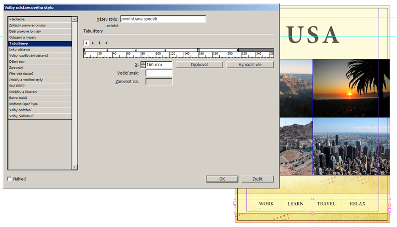
- Insert another box in the bottom part below the images and type several mottos there (work, study, travel, relax). Finish by creating a new Paragraph Style for these texts.
To achieve having uniform spaces between the words, use Tabs. You can set this options in the Paragraph Style. These Tabs are similar to tabs in programs like Microsoft Word etc. (you can choose left, center or right alignment). The final layout should appear similarly to the image below.
Inserting texts into the rest of the document
We are going to continue with filling in the rest of the pages. Create a new layer and place it above the background. The texts will be placed inside this layer. Create also two Rectangles a fill them with text, which is available in directory texts-cz in the archive you have downloaded. Adjust the height of these two Rectangles to fit them between images. The rectangles should not overlay any image. Create two Paragraph Styles for each partial title and for each text paragraph. You can also see the style for paragraph Hawaii where the right indent is set to 20 mm because of the image. There are more paragraphs with similar problems, so you have to find them and adjust their parameters.
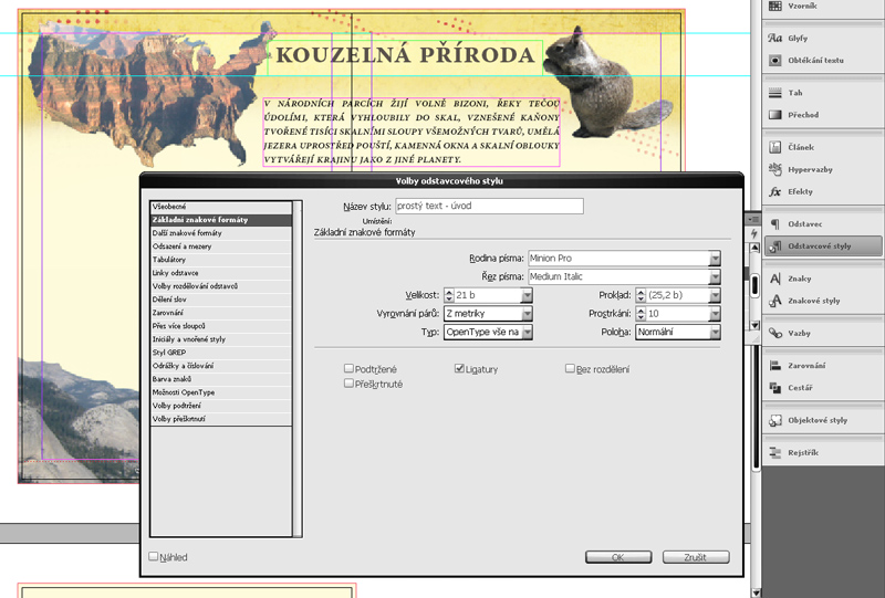
- Simple text - title - Minion Pro, Bold, Font Size 23 pt (Basic Character Formats); Alignment to Center, Indent before 4 mm, Indent after 3 mm (Indents and Spacing), Do not split words (Hyphenation).
- Simple text - Minion Pro, Regular, Font Size 15 pt, Interleaving 18 pt (Basic Character Formats); Alignment to Block (Left), Left Indent 5 mm, Right Indent 5 mm, Indent before 0 mm, Indent after 2 mm (Indents and Spacing); Split words (Hyphenation).
- Simple text - Hawaii - Right Indent 20 mm (Indents and Spacing).
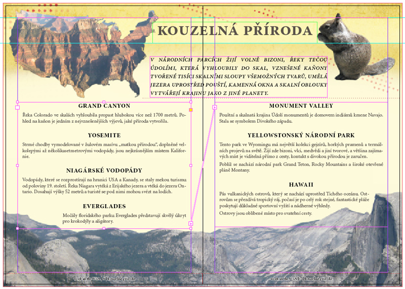
We are going to use the possibility to let the text flow from one rectangle to another one. Place all the text in the first rectangle, click on the arrow in bottom right corner of the box and the click on the other Rectangle. The program will automatically link these two boxes (you can see the link as a line connecting the boxes - visible in the picture above this text). You should pay attention to the active layer while placing texts because we want to place texts to their layer, headlines to the second one and images to the third one.
Very popular way to enrich the texts is to insert images directly between the text. You can then set the indent of the text and the image is placed in the text paragraphs. The following video shows how to place an image into a text.
- Place the image, resize it down and move it to the middle of the page to be surrounded by text.
- You can set the Indent directly for this image using Text Indent palette, or you can create a new Object Style if you plan to use similar settings for two or more images. There are many types of the Indent (Tight, Across the image, ...).
- Set the Indent for each side of the image and confirm.
While setting the Indent you should be aware of several things - the text distance from the image should be the same at all four sides of the image, you also should not leave only one row of text above or below the image. Most of these problems can be solved by slightly moving the image using arrow keys until you find an ideal position.
Table of contents and its styling
We still have to complete the last (rear) page where we are going to place a Table of Contents. In case you have not created the headline so far, do it now using the style named main headline.
Create a Rectangle under the headline and generate the Table of Contents using command Layout > Table of Contents.
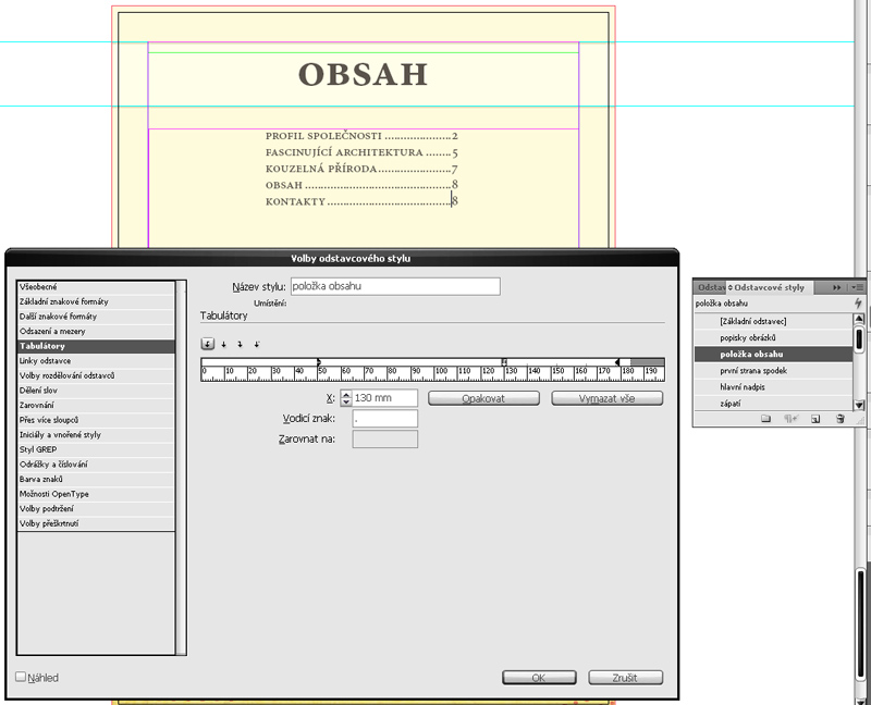
There are two boxes in the panel, you can see the list of all used paragraph styles in the right box and you can select which of them to use by dragging them into the left box.
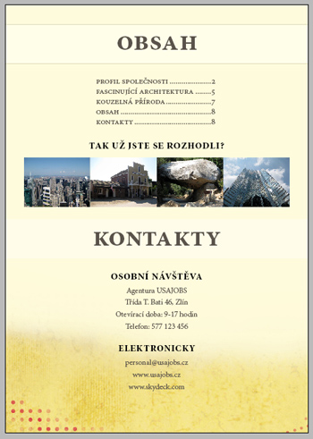
The process of generating the Table of Contents finds all appearances of selected styles and creates the final Table of Content in the place we select. The Table of Contents is re-editable of course. Choose the style main headline (drag it to the left box) and set Item Style to a new style. Confirm and you can see the complete Table of Contents. You can use Tabs to indent the text and the numbers, you can also use a guide char. The image below reflects the result of this procedure.
Insert several images below the headline (you can find them in directory images/back in the archive). Resize them proportionally to 1/4 of the page's width
(you will place 4 images in a row). You are going to place a contact section under these images. The images are already partly resized so you can work faster with them.
Note: you can also copy the first resized image three times and then click on each one and select Place - the placed image will be automatically resized to the defined box.
There is a file named background_5_rear_bottom.jpg in directory images so place it on the rear page and stretch it proportionally to fill the whole width of the page.
Create a Rectangle with text Contacts and another one below which will contain the contact information (you can find them in a text file in directory texts-cz.
You can use Paragraph Styles simple text - title and simple text, or you can create new ones.
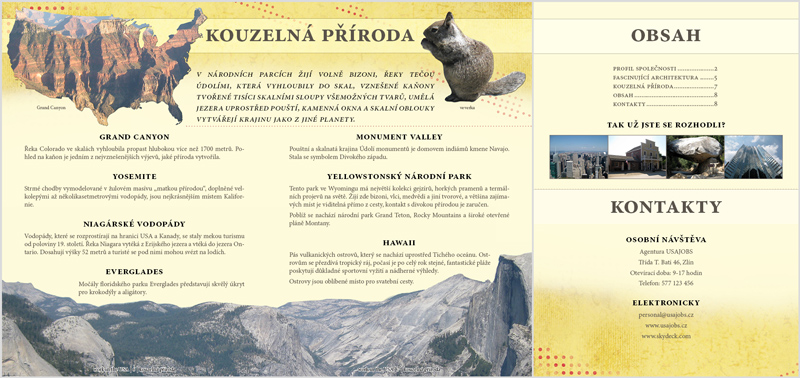
The rear page is ready now, you can see its preview below this text.
Utilizing the object styles
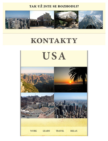
The brochure is almost done but we are going to deal with some visual adjustments now. When looking at the title page, we see that a thin border would be nice.
Create a new Object style and name it images border.
Setting the options of the border is very simple, we need to switch into part named Stroke, choose the color we defined for text (gray-brown) and lower
the Opacity to 80 %. Thickness and Type can be set at will, but 1px solid line seems to be the best one.
Apply this style to the images on the title and the rear page, eventually adjust the parameters.
The text which enlarges the headline should be anyhow separated from the rest of the page. The best tool for this purpose is probably the Line Tool. Create a new line under the text which enlarges the headline. Define a new color for this line (select Create a New Color in the Colors Palette and set values to 0, 75, 60, 25). Create a new Object Style for the line, switch to the part Stroke and set Thickness to 2 points and Type to Dotted. Duplicate the line to all two-up pages and stretch it to look smart. You can also improve the rear page by separating the contacts from the rest with a line.

Inserting legends to the images
We are going to add the last thing - the legends to the images. Simply add a new Rectangle for each legend, write the description inside and apply a suitable Paragraph Style (or create a new one). In case the added Rectangle has a border, set its Object style to None. There is no problem to Rotate the Rectangle to copy the shape of the image. Add 2 descriptions to the page connected to nature (Grand Canyon, squirrel), 3 to the architecture page (Hoover Dam, Las Vegas - tower, Chicago - inserted image) and 2 to the company page (international company, logo of the company).
However, there is still one problem. The image of the Earth has a shape of ellipse so it would be ideal to let the text copy this shape. You can use a tool Text on a Path for this purpose, this tool is grouped with Type tool. This tool allows us to define a shape (we will define an ellipse with the Ellipse tool for this image) and write on it (the tool will automatically process the text during typing).
Using vertical lines connected with rectangles (there are two objects like this on the perimeter of the ellipse) you can adjust the left and right border of the input text. By dragging the vertical line in the middle of those two objects you can move with both at once, or you can drag the text from the inside to the outside and vice versa. Using the Text on a Path tool is demonstrated in the following video.
Finally
The completed brochure can be exported to PDF. To join the two-up pages, you have to check this option in Pages Panel after clicking File > Export. You can also set the quality of images in Compression Panel if you want to print your brochure.
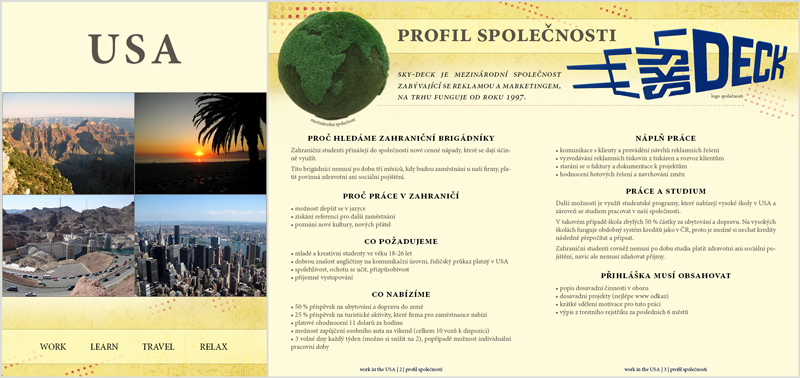
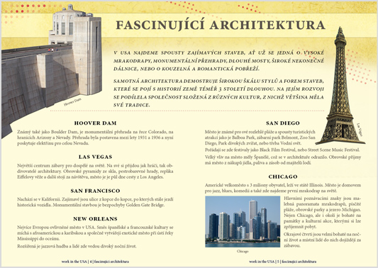
If you followed all previous instructions, your brochure should appear approximately like the one in the images below. The texts can be edited of course to fill the pages precisely.
Additional materials
Questions and Tasks
- Try to experiment with fonts and colors of texts and headlines, surely you can find a better combination than we used.
- Because of the fact that the brochure contains two-up pages, modify the footer that every two-up page will contain only one footer.