
Graphics for Advertising E-mail
 Content
of the lesson:
Content
of the lesson:
- Examples of Advertising E-mails
- Rules for Advertising E-mails
- Final Document from This Lesson
- Working with Guides
- Creation of Spaces with Identical Width
- Creation of Header and Logo
- List of Hotels
- Facultative Trips
- Footer with Logos of Credit Cards
Examples of Advertising E-mails
You can look at several examples of advertisement at the beginning. These posters were sent to clients via e-mail. Try to observe the characteristic features because you will create a similar document in this lesson.
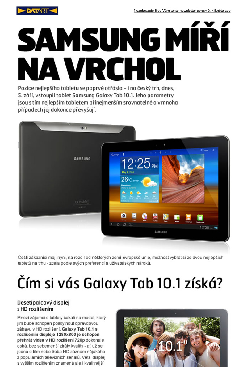
We can say that this example from DATART is the cleanest one. You can see the simplicity of colors and fonts, no disturbing elements and elegant shadows.
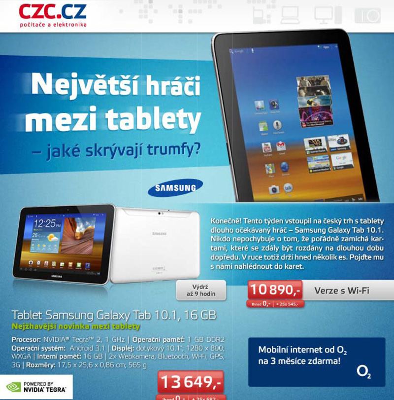
This example from Czech Computer is a little bit wilder, however, you can still see simplicity of colors and usage of 3D effects for borders with prices and descriptions. Elegant shadows for items were used too.
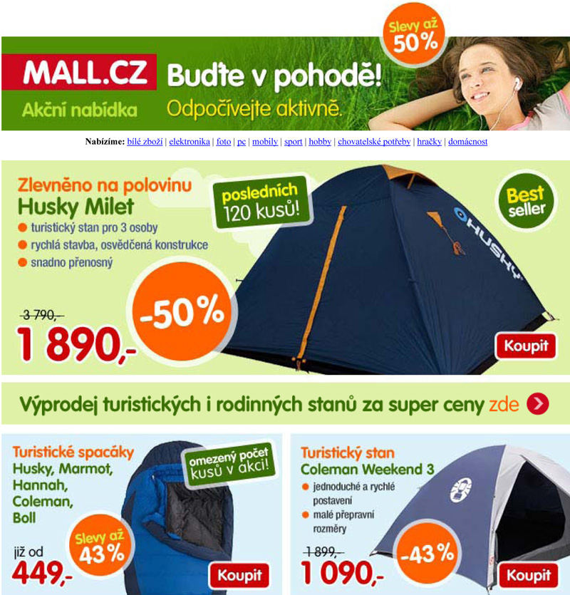
The last example from Mall looks like a classical advertising poster which is being thrown into mailboxes. You can see a plenty of colors which makes the poster confusing. The author also combined too many shapes and fonts together. However, you can see the precise distribution of single parts using spaces with the same width.
Rules for Advertising E-mails
The creation of advertising posters is quite difficult process because you should respect several generally known standards:
- Spaces between objects should be of the same width (you can see this in the third example)
- You should use one, maximally two fonts to make the document uniform (texts in bold and italics are not counted)
- You should not combine too many colors if you do not want to confuse the client. On the top of that you should choose colors which correspond with the topic - for example warm colors for a holiday poster
- Using graphical elements as borders, dividing lines, several bullets and shapes can help you to make a well-arranged document
- Texts should not contain any mistakes because any mistake can cost you a lot of money
- You cannot use photos without having all rights for them
You can use Adobe Photoshop or Adobe InDesign for creating a poster; both programs have their advantages and disadvantages. We will use the Adobe Photoshop this time. Save the document regularly, add new layers before editing the document and divide layers into groups for better orientation. You should often use Guides for precise layout.
Final Document from This Lesson
We will try to create an advertising e-mail for a fictive travel agency which will offer a tour to United Arabic Emirates with facultative trips.
The following elements will be added into our document:
- Logo of company and header information like the date range when this discount can be used etc.
- Distinctive headline which will represent the topic of this offer
- List of different hotels with names, photos of environment, available possibilities and prices
- Significant headline for the list of facultative trips
- List of trips with photos for imagination, description of trips, days and times of arrivals and prices which will be highlighted
- List of usable credit cards in the footer part
- Contact information (e-mail, phone) and additional information in the bottom part of the document
- Single items will be separated by separating lines
Download the photos for all hotels and trips (1 MiB) and logos of credit cardst (90 kiB) which will be used inside the document - photos were resized because the full quality and resolution is not needed.
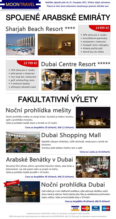
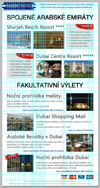
You can see the final document in the following image (the jpg file in the left image and usage of Guides in the right image - you can add as many Guides as you want).
Working with Guides
Working with Guides is easy; Guides are horizontal or vertical lines which can be added to the scene. Guides can help you to align two objects horizontally or vertically. All objects are snapped to Guides in case you do not turn this option off (in the menu View > Snap). When you are adding a Guide it is also snapped to objects from the selected layer.
Guides can be added by clicking on the Ruler (in case the Ruler is not visible you can display it by command View > Ruler) and dragging the line from that Ruler. You can then move the lines using the Move tool. In case that you want to remove it, you should drag it back to the Ruler area.
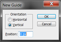
The second option is to add a Guide at exact position using the command View > Add Guide. The following dialogue window will appear and you can set horizontal or vertical orientation and the exact position according to the Ruler.
Creation of Spaces with Identical Width
Before we start creating the document, you should know how to create the same spaces between objects because this technique will be used quite often. You can see three basic ways which should be enough to complete the rest of the document.
Objects Distribution I
You have several identical objects and you want to make the same spaces between them. The following video describes this procedure; the description of steps is available under the video.
- Create 4 identical objects (duplicate the first one three times) and place them randomly in a row.
- Select all 4 layers and choose the Move tool.
- Click on the button Distribute Horizontal Centers in the tool panel. After this step the spaces between objects will have the same width - this tool will take the position of centers of outer objects and computes the location of the remaining layers between them.
Objects Distribution II
You will also need to solve a situation when you know the width of objects (or you can find it out using Ruler and Guides) and you know the assigned width of spaces. In this case you cannot distribute the centers because you do not know the position of outer objects. You have to compute the position of outer objects at first and then use the distribute tool.
- Assume that we use 100 pixels wide objects - these objects are created in the beginning using the Guides.
- We know only the position of the first object, its width and the width of the spaces which should be used between both couples of identical objects.
- The easiest way is to compute the position of the last object using a calculator - you have 4 objects with width of 100 pixels and 3 spaces with width of 20 pixels between them. This gives you a transformation of 460 pixels which will represent the right edge of the last object.
- Place the second outer object. Now you can use the tool Distribute Horizontal Centers from the tool panel of course. You can check that the spaces between objects are really 20 pixels wide.
This procedure can be used especially when you need to have the same space between horizontal objects as between this and the previous row of objects (vertical space).
Objects Distribution III
The last solved situation is similar to the previous one but you have objects of different sizes. You know the width (of can find it out) and the width of space is assigned.
- Assume that you have two 100 pixels wide objects and one 200 pixels wide object - these objects are created in the beginning using Guides.
- We use the calculator again - you have 2 objects with 100 pixels width and one with 200 pixels width plus 20 pixels wide spaces. This means a movement of 440 pixels according to the left edge of the first object.
- Now we cannot use the Distribute Horizontal Center tool because the objects are not identical, we have to use the secondary tool Distribute Left Edges. We might use the third tool Distribute Right Edges in a suitable situation.
- We can check that the spaces are really 20 pixels wide.
Creation of Header and Logo
Create a new document and set the size to 2000x3000 pixels, we will adjust the height according to our needs. Draw a 700x150 pixels rectangle in the top left corner (you should use Guides for this purpose - you can add them using the command View> Add Guide). Select a suitable blue color, for example RGB(2, 0, 104).
The shape of the logo is not difficult, you have to divide the height to 5 sections and create the side shapes using a mask - the shapes are identical at both sides, only mirrored.
Then add the text MOONTRAVEL to the center. This text will represent the name of our travel agency. Use the font Segoe UI (size 18pt) which is sans-serif on purpose and divide the text optically using different colors for the parts - color RGB(254, 218, 129) for the text MOON and RGB(230, 128, 19) for the text TRAVEL. You should also adjust the spacing of characters to fit the text into the logo. Do not forget to align the text to center but do not try to guess the position, use a proper tool.
At the end we duplicate the logo, mirror the duplicated layer vertically, apply a mask and create the effect of shadow.
The logo is complete, we will continue with the rest of the header.

You can copy the text from here:
				Nabídka zájezdů platí do 31. listopadu 2011. Změna údajů vyhrazena.

				Pokud se Vám tento dokument nezobrazuje správně, klikněte sem.
You can see that the same font is used (this font is used in the whole document except the main headlines) but the size is adjusted to 8pt. Both texts are centered between the right border of document and the right border of logo. For optical separation a thin 1px line of the same color as the text is used. The transparency of this line is decreased to 40 %. The distances from the line to both texts has to be the same and the whole group should be horizontally centered according to the logo (you can use Guides for this purpose).
Leave some space below the header and create a new Guide at position 250 pixels where you will continue in the next part.
List of Hotels
The next part is a list of hotels with photos and descriptions including the prices. The first significant headline is added at first to say what type of offer it is. We used the font Swis 721 for it, its size was adjusted by the Transform tool because we need to leave 100 pixels wide borders at both sides of the document - these borders will remain in the rest of the document so it is a good idea to create Guides.
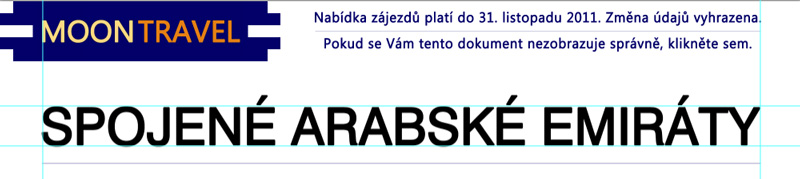
Create the headline SPOJENÉ ARABSKÉ EMIRÁTY. The bottom border of this headline should be placed at the position 350 pixels vertically and we will place a copy of the separating line from the header 50 pixels below it - of course we will adjust its width to be stretched between document borders.
Then we will add the first hotel. This consists of the title Sharjah Beach Resort ****, two photos which can be found in the downloaded archive and a border with information. The title should be aligned to the left border of the page and will be stretched between both photos (use spacing of the font).
The space between photos should be the same as between the right photo and the border. The border is a simple rectangle with light gray background and a thin border. The background for the price was created by the Ellipse tool and the price was correctly aligned so the distance from the top border of the rectangle is the same as the distance from the right one. You can see that the space between thousands and hundreds in the price was reduced - a half space should be used in this case.
The bullets can be realized using the Ellipse tool. You can then duplicate them to fit to the text. You can create the text as one part and adjust the line height only. Pay attention to leave the same distance between bullets and the left border as between the text and the bottom border. A dark gray color was used for the text.
Both photos and the rectangle have a thin gray border, its transparency was decreased. Also the price has its border with lower opacity to highlight the text.
This part is finished, duplicate the separating line which is under the main headline and place it below the photos - the distance should be the same as between the main headline and the rectangle with information. Do not try to guess the location, use Guides for this purpose.
The whole result can look like the following one:
We will create the advertisement for the second hotel very similarly, photos are available in the archive, we will again have to adjust spacing of the title to fit nicely - we added one star to gain bigger width. All spaces have to be the same as in the previous step.
We can duplicate all layers from the previous step and move them down so the space between the rectangle with information and the separating line will be the same as in the previous step. We can link layers of photos with the title and move them to the right border and then we should adjust the title. Similarly we will link all layers within the rectangle (texts, price, background, bullets) before moving it.
The whole result of the second hotel:
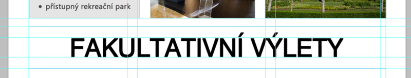
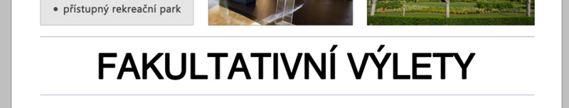
Facultative Trips
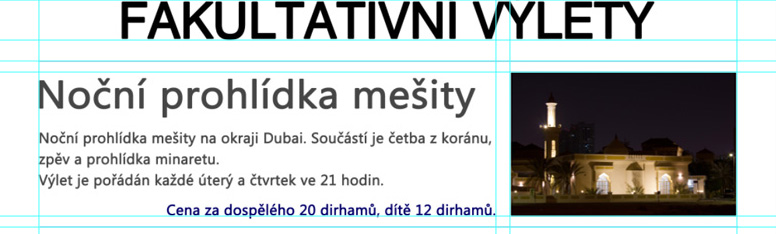
The next part consists of facultative trips. We should add the headline at first which will be separated from both vertical sides with separating lines (the distance should be the same - Í and Ý letters are ignored). The following images illustrate the location of this headline.
Facultative trips are realized similarly as the list of hotels - each group consists of its title, description, price and photo. There are 4 groups and the photos are alternately placed on the right and left sides.
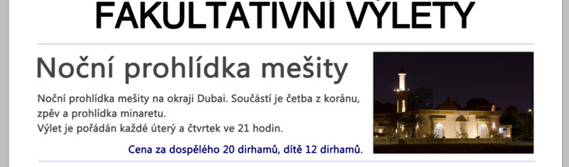
There is a headline "Noční prohlídka mešity" aligned to the left border of page as well as the description below it in the first group. Text is realized using the text field (you can create it using the Text tool and dragging a rectangle for your text). The size of the text field can be adjusted by dragging the edges.
Place the photo on the right border of page and create a thin border around it using the layer styles. Then stretch the text field - the distance between its right edge and the photo should be the same as the space between the photo and the separating line above it.
We will use the left alignment for the first 3 lines and the right alignment for the last line, the last line also has bigger line height and different font color (blue color from the logo) to be separated. The bottom border of the last line should correspond with the bottom border of the photo.
There is another separating line below this block of information.
The final version of this part is shown in the following image; you can also see the layout of Guides to illustrate the alignment and spaces:
We will create the 3 remaining trips using the same way. Do not forget to link layers when changing layout to avoid aligning them again.
The middle section with trips should look like the following one:
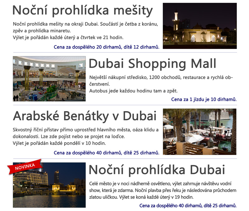
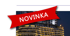
You might noticed that the last trip contains a label NOVINKA. This label was created using the Custom Shape tool and the same red color as for the background of prices in the list of hotels. The text was written using white color.
It is better to align the text NOVINKA to the center of the shape and then rotate both layers at once to be sure that the alignment will be all right.
The middle part is finished after this step.
Footer with Logos of Credit Cards
The footer contains only logos of credit cards which can be found in the downloaded archive. The spaces between couples of logos should be the same (use the Distribute Horizontal Centers).

Another object which will be added is text with contacts and additional information. This text should be centered in the bottom part of our document; we will use a lighter gray color not to disturb the rest of the document. The space between credit cards and the first line should be the same as the space between the second line and the bottom edge of our document.
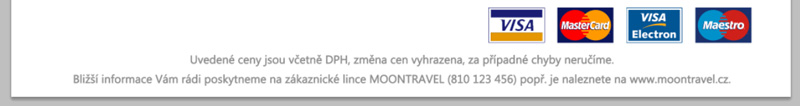
You do not have to rewrite the text of course, copy it here:
Uvedené ceny jsou včetně DPH, změna cen vyhrazena, za případné chyby neručíme. Bližší informace Vám rádi poskytneme na zákaznické lince MOONTRAVEL (810 123 456) popř. je naleznete na www.moontravel.cz.
You can experiment but try to keep the rules not to convert this correct document into an advertising farce. You can see the whole document in the following image or download it in the full resolution here (3,0 MiB).
