Balance and Harmony of Elements in Document
 Content
of the lesson:
Content
of the lesson:
- Specifications of Document
- Way to the Basic Draft
- Additional Variants of Combinations of Elements from the First Draft and Their Modifications
- Changing the Format of Page (Horizontal Variant)
- Changing the Format of Page (Horizontal Variant with Half Height)
Specifications of Document
We will look at the process of creating a simple draft of document which will contain two headlines, a short text and a photo. You will see several possibilities of layout of single graphic and text elements inside the document according to the format of the final document. You will see the process of creating a draft of document from the first variant to the final one. We will try to realize the final document in more variants.
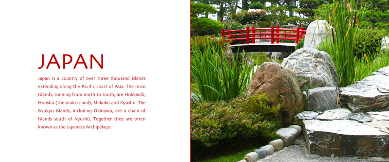
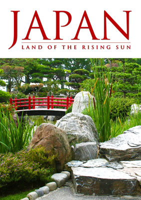
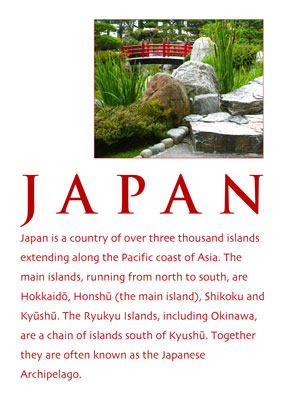
The first step is creating the content of the document and choosing a photo in addition to the text content. In our case the whole process will be demonstrated on the following document about Japan. The text part consists of:
- main headline "Japan",
- subheading "Land Of Rising Sun" (optional item)
- text paragraphs with headline Geography (this headline is not compulsory for next variants)
Additional text (http://en.wikipedia.org/wiki/Japan):
Our task is to deploy these elements into our document of assigned size. We will consider a A4 vertical document at first.
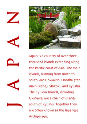
Way to the Basic Draft
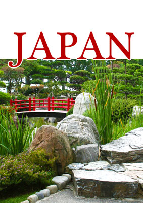
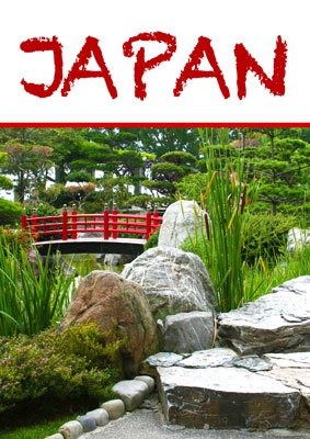
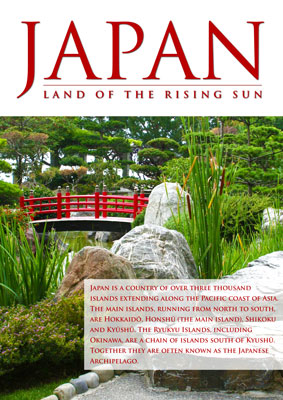
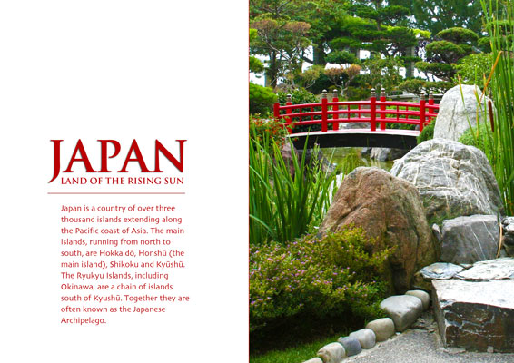
Drafts 1-2
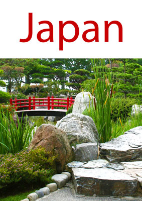
Choose a suitable sans-serif font and red color (color of the Japanese flag) at first. Use the hue of red color from the photo (you can get it using the Eyedropper tool) or you might use red color from any Japanese flag. Experiment with the size of font and spacing of characters.
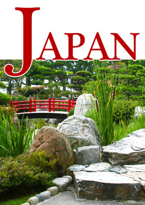
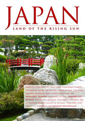
Drafts 3-4
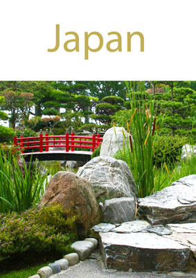
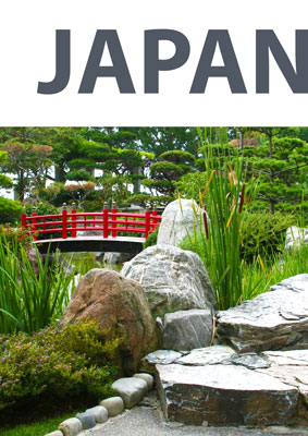
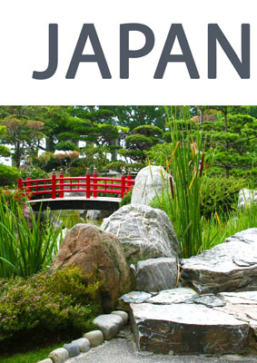
We will experiment with the color in the six following drafts. A short headline written by caps is significant and well readable.
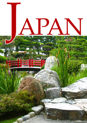
Drafts 5-6
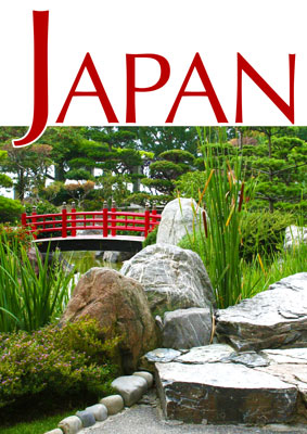
Drafts 7-8

Drafts 9-10
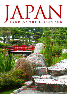
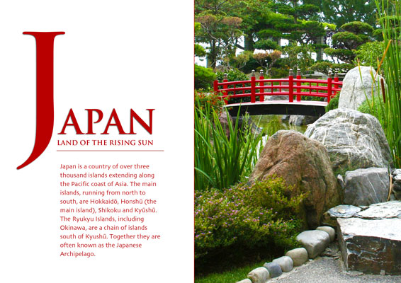
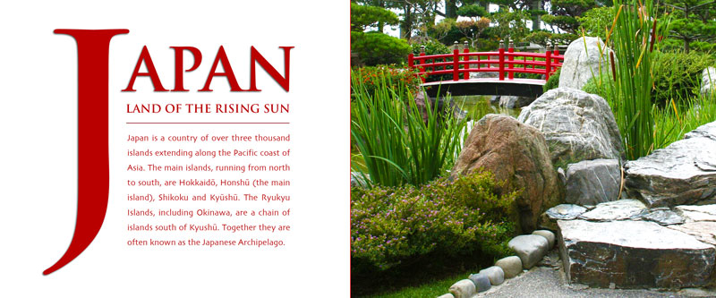
We can also try a variant when the text is connected to the photo and its readability is improved using a white border around letters. Create a large initial to emphasize the headline.
Drafts 11-12
Then we search for a suitable font according to our imaginations. The result should nicely fit into the document.
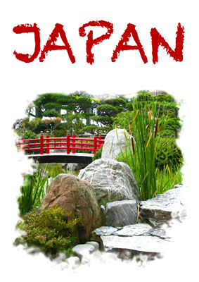
Drafts 13-14
You can test an accidental font and also non-regular borders of the photo created by a mask and the Brush tool.
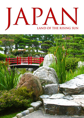
Drafts 15-16
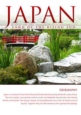
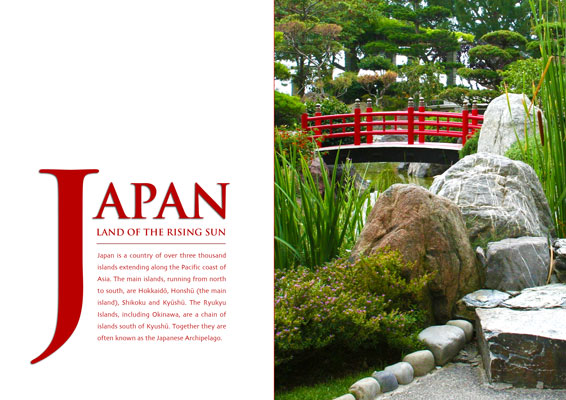
Finally we find a suitable and elegant font and add the string "Land of the rising sun". At first we try to align the text to the left and then to the right (the alignment to the right seems to be better).
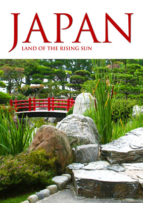
Drafts 17-18
Then we increase the spacing of letters to stretch the text under the whole headline "Japan" and to align it nicely from both sides. We add a thin line as a graphical supplement of the text.

Drafts 19-20
We add another text (a paragraph of text) in the next step. It is not readable without any background so we add a white rectangle as the background.
Drafts 21-22
We decrease the line height and the background rectangle and also slightly reduce the transparency of the rectangle.
Drafts 23-24
We experiment with converting terms inside the text to bold and add a thin border for the background rectangle and also for the main headline Japan.

Drafts 25-26
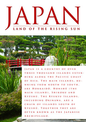
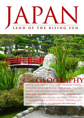
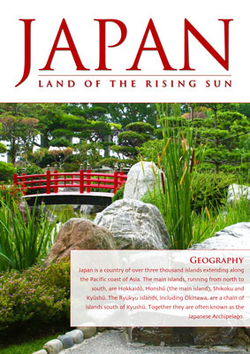
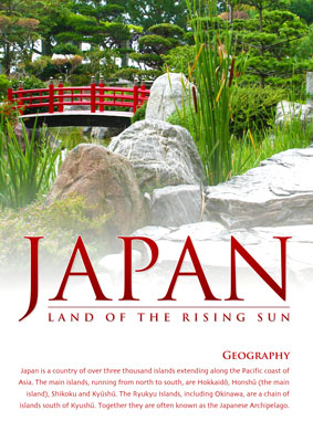
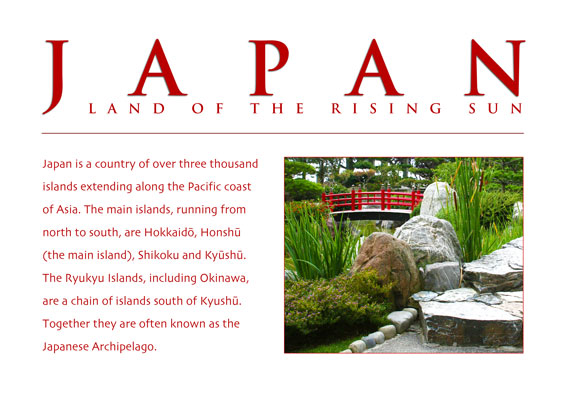
Another subheading "Geography" is added and we try to improve the readability by adding the Outer glow effect.
Drafts 27-28
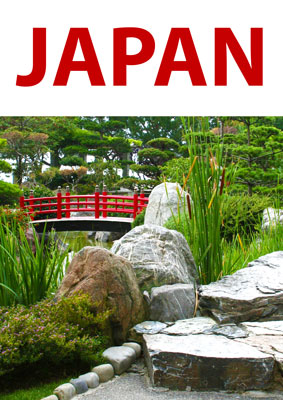
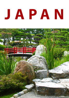
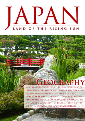
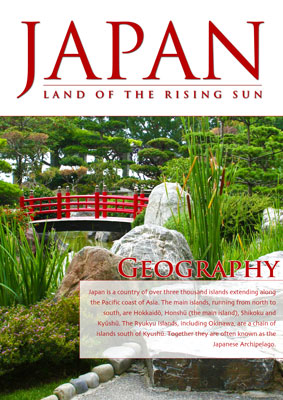
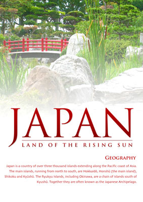
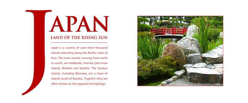
Finally we insert the subheading in a white rectangle too. We decrease the transparency of the rectangle to even improve the readability of text. We got to a draft which contains everything needed and we are satisfied. The final draft can be downloaded in the full resolution: japonsko-12n-full.jpg.
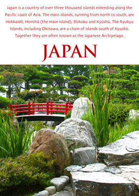
Additional Variants of Combinations of Elements from the First Draft and Their Modifications
Drafts 1-2
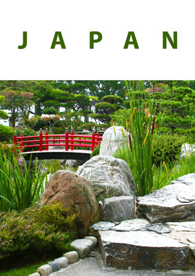
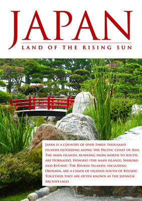
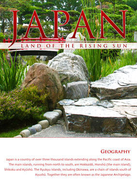
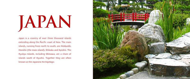
You can use a light red gradient inside the headline to get a nice result. There is a problem with readability in the first case (this would probably not be a problem in case you were creating the first page for a well-known magazine). We added a semi-transparent background for the subheading because it was not possible to read the small letters in front of the photo. Then you can see another draft which uses a mask gradient behind the main headline to improve the readability - the photo slowly vanishes into the white background color.
Drafts 3-4
The next variant contains a movement of the main headline to 2/3 of the height and also a mask with gradient was used so the photo slowly vanishes to the white background. The paragraph text in the second draft was aligned to correspond with the borders of the main headline.

Drafts 5-6
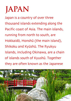
The readability of the photo in the first draft was improved because it was too featureless due to the gradient. We got another nice variant after this modification. Then we experimented with the layout of elements inside the document and with its effects on the impression from the document. The variant 6 uses the image as additional information to the text and the image is used rather to attract the attention of the reader and to pull him in the article.
Drafts 7-8
The image size was significantly reduced in the variant 7 so it is used only as a visual link to the article. The reader should deal with the article in this variant. The significant headline in the variant 8 should attract the reader before he sees the image and the following text.
Drafts 9-10
At first you can see a variant with significant and rotated headline. The image in the next variant is dominant again as well as the headline. A reader reads this document in this order: image, headline, text.
Changing the Format of Page (Horizontal Variant)
Horizontal Draft 1
The image and the text occupy approximately the same area and the headline is dominant. The whole composition is conservative and calm.
Horizontal Draft 2
You can see that the most emphasis is placed on the image; however, the headline is also quite significant and returns the reader to the text.
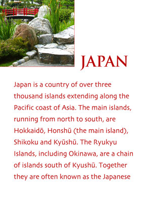
Horizontal Draft 3
The emphasis on the text is strengthened by the significant initial letter which divides the attention equally between the text and the photo.
Horizontal Draft 4
Movement of the initial letter created space in the draft and it appears more gracefully, spaciously and still preserves the nice emphasis on the text.
Changing the Format of Page (Horizontal Variant with Half Height)
The following drafts A-D illustrate the migration from the dominant text to the dominant photo. In the first draft you can see that the photo is rather complementary (the text is highlighted) but the in last draft the reader should see the photo at first and the text is rather complementary.
Návrh A
Návrh B
Návrh C
Návrh D