
Christmas Decorations
 Content
of the lesson:
Content
of the lesson:
- Creation of Christmas Cards
- Explanation of New Techniques
Prologue
In this lesson we will create three Christmas cards which can be used as a nice wish or as a PF card. We will explain several procedures how to realize those cards. In the end you will use new knowledge to create your own card.
You will need the archive with photos which is available on the network drive.
Card I
We will create the following card using guides, mask, text tool and layers styles.

- We can start with importing the photo 1 into Adobe Photoshop and
converting it to a layer. Flip the layer horizontally because the
dark color will be nicer at the border. We will try to place the
right sphere to have the same distance to the right and to the
bottom border (the procedure is shown in the following video).
Get the Flash Player to see this player.(video size: 4,08 MB) - You can see that you are able to find out the width and height of your document using the Canvas size tool and then you can add Guides from the menu to the positions width - 400 and height - 400 (or different values of indentation). You can then move the photo to the corner and crop that part of document which has white background.
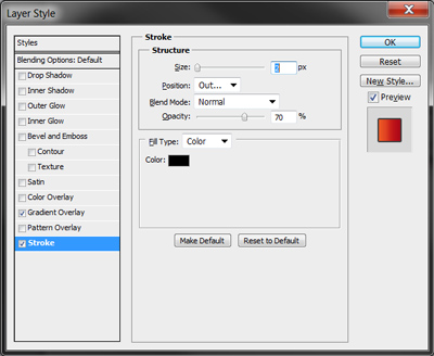
- Using the same procedure you can insert a Guide for the headline and
resize the headline to fit into the width of spheres. The font Gabriola
with size 300pt was used. You can add layer styles to highlight the
text.
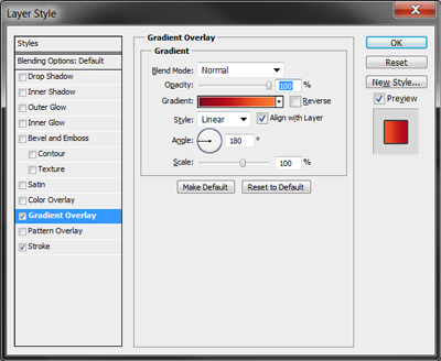
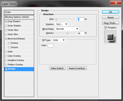
Stroke:
Gradient overlay (use colors from spheres):
Result:
- Now you should consider how the card will be used - in case you want to print it as a photo you should use the Canvas size tool and a calculator to change the aspect ratio (to 3:2 or 4:3) and adjust the border of the inserted photo using the retouching tools of course.
- The last thing which will be added is the photo 3 which should be rotated, resized and placed in the left part. Clean the gradient using the mask and a softer brush.
- The whole document is completed, you can see the result in the following image (the first version has aspect ratio 3:2, the second one 4:3 - the difference is not large).

Card II
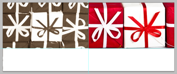
The following card is also not difficult; you can see its preview in the following image. We will use Guides again, the Line tool to separate the photos from the text, then adjustment layers to adjust the color of photos and the text tool.
- Create a new document 1500x600 pixels. Place a Guide in the
middle of its width and a second one 400 pixels from the top. Resize
and place photos 4 and 9. To make visible only a rectangular selection
from the photos you can use a quick variant with mask - select the
rectangle which will be visible from the layer and apply the mask.
Adobe Photoshop automatically makes the selected area visible and
fills the rest of the mask with black color.
- Then we will need to adjust colors. The photos have different
colors of gifts and also the contrast is not ideal. We can start
with the left photo. Select the visible rectangle (hold Ctrl and
click into the mask) and add the adjustment layer Levels. Set it to
gain a higher contrast (use values 25 – 0,89 – 255).

- Continue with the right layer, select it using the same
procedure and add the adjustment layer Hue/Saturation. Use suitable settings to
balance the colors (hue +16, saturation -56, lightness 0). Add
Levels and use the settings 80 – 0,91 – 255 to darken the photo a
bit. All color corrections are completed.
- Add another Guide 425 pixels from the top and fill the new strip
into a new layer using a suitable brown color. You can then
experiment with the color - select the area, add the Hue/Saturation
layer (a mask will be generated automatically) and adjust the hue. Use
the same procedure to add a suitable background for the bottom part
of the document (into a new layer).

- The layer with the strip is not well visible in the document so
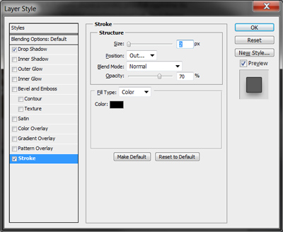
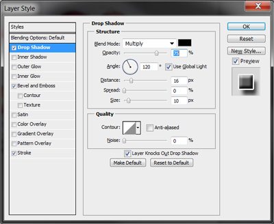
we can add a light effect of Stroke and Drop Shadow.
Stroke:
Drop Shadow:
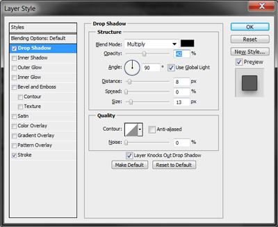
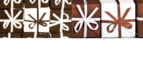
Result:
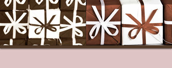
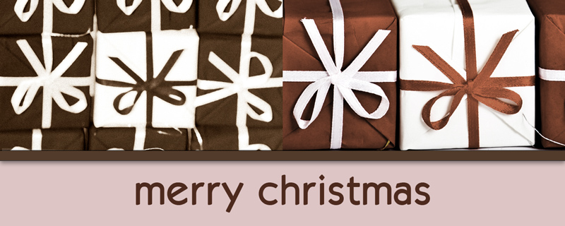
- The last step is to add a text using a suitable font (we used KabanaBook, size 95pt in the document). If necessary you can add Stroke to highlight it (his font does not contain bold variant so it was simulated by a Stroke of the same color as the text). The whole result can be seen in the following image.
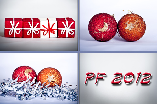
Card III
Finally we will create a PF card which will consist of several images, then we will add two lines and a simple text. The result will be improved adding several snowflakes to the background.

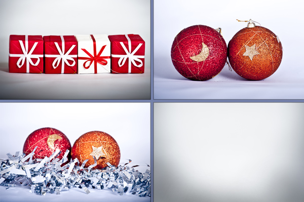
- Create a new document 1200x800 pixels (aspect ratio 3:2). Start
with adding Guides in the middle of both axis to divide the document
to 4 identical parts. Then import photos number 1, 3 and 4, resize
them and place them in the created parts. You can adjust the
contrast and more if needed of course.
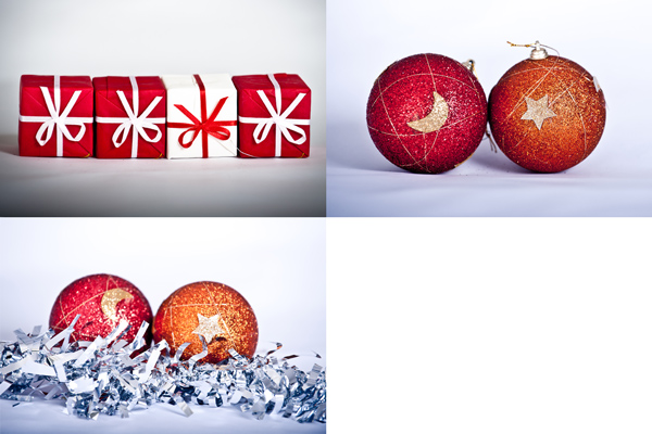
- Then add the photo number 4 to the last field, resize it and use
a mask to create a suitable background. You can also use the Brush
tool with lower opacity and complete the background into a new
layer.
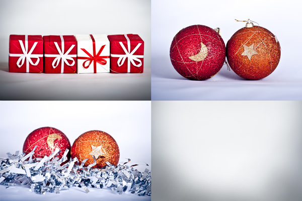
- Add two lines to divide the parts, merge them and apply the
Stroke effect on the final layer.

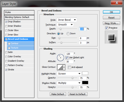
- Add the text PF 2012, use red color from any of the inserted
images and apply the effects Stroke, Drop shadow, Bevel and Emboss.
Do not forget to align the text to the middle of the field.
Stroke:
Drop shadow:
Bevel and Emboss:
Result:
- The last thing which we will do is adding several snowflakes as
a background of the text. We will use the Brush for this purpose, so
we will go through the libraries of brushes until you find a
suitable snow flake and then we will adjust the advanced settings of
the brush (these settings can be displayed by clicking on the icon
of panel between the size of the Brush and the type of blending.
A new panel will appear and you can adjust the settings here. The detail description of all items is available in the PDF file in the section Additional Texts.
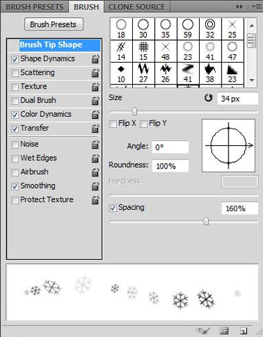
In the bookmark Brush Tip Shape you can choose the size and set Spacing to 160 %. You will get larger spaces between flakes.
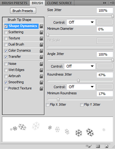
Check the field Shape Dynamics and apply the settings from the image.
Then we will use Color Dynamics. Here you set differences between colors of single flakes and more.
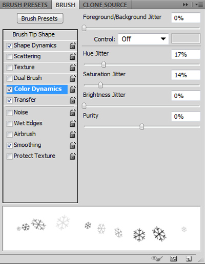
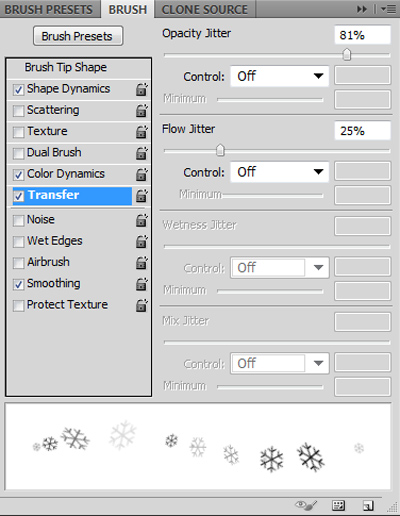
The next settings will be done in the window Transfer where you can set opacity and flow to change automatically.
Finally check the field Smoothing and you are finished. Then you can slightly add flakes by clicking on the canvas into a new layer and create the background for the text. The whole result is displayed in the following image.
Individual Task
Everything is explained and finished, your task is to create a similar Christmas card which will be usable. Do not forget to use a correct aspect ratio if you plan to use it and print it.